How do you get people to do what you want them to do? That’s goal of marketing, isn’t it? You want your target audience to engage, click, scroll, register, continue their journey and, ultimately, buy your product/service.
Given our recent series of articles looking at design (links at the bottom), if will likely come as no surprise that that is the answer: good, well-thought-through design.
Whether a webpage, brochure or other piece of marketing collateral, how things look will play as big a role as the underlying message itself. Arguably more, as we are living in a world with short, and rapidly shrinking, attention spans.
If it doesn’t look appealing, it is highly unlikely that someone will stick around long enough to fully digest the content.
Getting things in the right order
Gestalt psychology is the basis of a lot of modern design. Translated from German, ‘Gestalt’ means shape or form and the psychology behind it relates to how people organise and group objects.
The human brain is wired to make connections and it’s in understanding this that good designers can lay a carefully constructed path for people to unconsciously follow.
This is where tricks of the User eXperience and User Interface trades come into play (if you are interested in finding out more about why UX and UI are not the same thing, click here).
For Alpha Agency designer Hannah Wallis, the Gestalt principles of design form the foundation of the work she does, whether redesigning entire websites or individual webpages. Below she shares some of the key areas for companies to consider.
Hierarchy
As the image below shows, size and weight are two ways a website visitor can be taken on a journey.
You can bring together copy in a visually interesting way but still ensure that it is read in the right order, so design does not sacrifice understandability.

Proximity
Designers often group items together into lists or by using repeated shapes. From a user journey perspective, however, this can cause problems. While it looks neat and orderly, when everything in a group is given equal prominence, nothing really has prominence.
By using colour and/or a hover effect, it becomes clearer to the visitor which of the grouped items has been selected.
The Alpha Agency navigation menu is a great example of this. Click on the hamburger menu icon at the top of this page to open up the navigation panel. Hover over the individul sections and see them change colour from white to green. The difference is subtle, but it's helpful to the user.
Easy to find
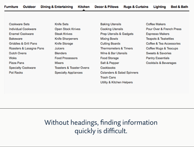
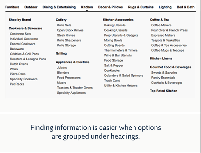
Lists and menus are where hierarchy and proximity most often converge, as the examples below show.
The first image is a comprehensive list of all of the different items a user can buy at an online retailer, but the options are not grouped together in a logical or easily digestible way.

In contrast, in the second image, when organised under headings that have been given greater prominence, the lists can be scanned, and the user will more easily be able to find what they are looking for.

Staying on trend
An analogy that can be helpful when talking about websites is thinking of them as a shop front. High-end designers don’t clutter their windows with everything they sell. They carefully select key pieces that showcase the quality and value that shoppers can expect to encounter should they cross their threshold.
Throughout the year, the items on display change, with greater prominence given to a particular line or trend. These windows are never stagnant and they are always visually interesting.
For Hannah, it's all about balance and space. "When there are too many random elements that don't fit together or you're trying to give prominence to too many things, that creates cognitive overload. Differentiation can be subtle, for example using an icon to let people know that a piece of content is a podcast or a video to help the user identify what they are looking for.
"It's a combination of colour, size and weight. Giving prominence to key elements and leaving enough white space so the pages don't overwhelm visitors."
A little bit of homework
It's not very often that we visit our own company's website, let alone think about it from a new vistor's perspective. So, why not take a few minutes to do just that?
Go to your company's homepage (you may need to clear your cookies and cache to get the true first-time user experience) and ask yourself the following questions:
- What does it look like?
- Are there a lot of moving parts?
- Are the colours dull or engaging?
- Do I immediately understand what the company is/does?
- Do I know where to look or am I visually over/underwhelmed?
- Does any particular element have clear prominence?
- Is the menu easy to find and navigate?
- If I wanted to find the contact details for the sales team, do I know how to navigate there?
- Is everything on the front page still in date?
If you are interested in finding out more about how to refine the client journeys on your website, please don't hesitate to reach out to Alpha Agency.
In case you missed it:
What marketers can learn from industrial design
When to refresh your brand: a graphic designer's perspective
